Card View and Overlay in FeedWind
The Card View and Overlay styles are for users who want to emphasize images over text. They are ideal for feeds which contain articles that link to visual pages like YouTube. This document is to give more detail on the settings involved with card view and overlay options than the main style settings document.
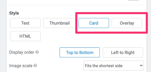
Card and Overlay Settings
Below are the details of each option under ‘Card’ in the settings screen. The additional settings for the ‘Overlay’ view are added at the end:
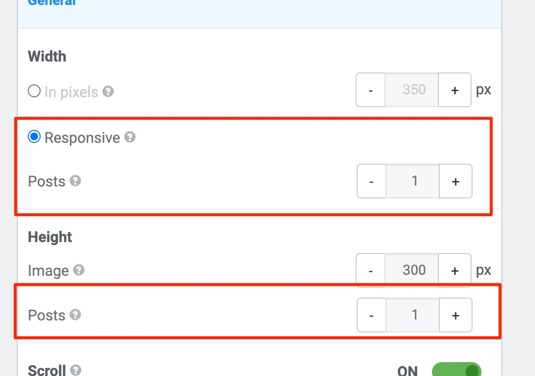
- Width – Adjusts the width of posts in a feed. The individual options are as follows:
- In pixels – Enter width in pixels. This will fix the width of your widget regardless of the browser/page/column width.
- Responsive – For mobile-friendly behavior or desktop browsers with responsive capability. The widget resizes to fit the column/page/container width.
- Posts – Decides how many posts are displayed horizontally. More than one post will disable the fade transition.
- Height – Adjusts the height of posts in a feed.
- In pixels – Enter an image height in pixels. This will fix the image height of your widget regardless of the browser/page/column height.
- Posts – Decides how many posts are displayed vertically and fixes the height of your widget according to the number of feed items.
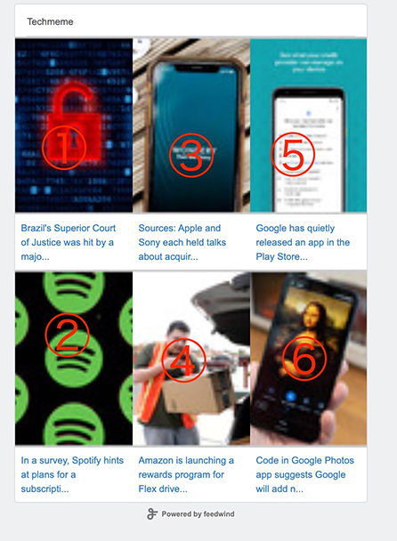
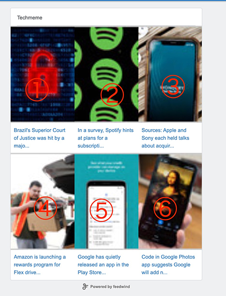
- Display Order – Changes the order in which the cards are displayed, between ‘Top to Bottom’ and ‘Left to Right’.
| Top to Bottom | Left to Right |
 |
 |
- Image Scale – Determines how the image will scale to fit within the widget. Images can be scaled using the following options:
- Fill – Stretches or compresses the source image to fill the widget
- Fits the shortest side – Fits the shortest side of the source image within the widget, while maintaining the original aspect ratio.
- Fits the longest edge – Fits the longest edge of the source image within the widget while maintaining the original aspect ratio.
- Not stretch – Works the same as best-fit, but will not stretch the source if it is smaller than the target.
- Original size – The source image is left unscaled
- Image Align – Determines how the image is aligned within the widget, between these options:
- Left
- Right
- Center
- Top
- Top Left
- Top Right
- Bottom Left
- Bottom Right
- Add Space Between Posts – Determines how much space is between each post, measured in pixels.
All of the above are included in the standard settings for the Overlay View, along with two additional settings to accommodate the overlay’s transparency. These are mutually exclusive, meaning that if you pick one, the other will be disabled:
- Background – This allows you to enter a hexadecimal color code (e.g. rgba(255,255,255,0.8) for white), or click on the color icon to choose from the color picker. This color reflects the background color of the overlay itself, not the widget.
- Add linear-gradient background – This allows you to enter a hexadecimal color code, or click on the color icon to choose from the color picker for the background color of the feed or title.
Related posts

Pinterest Widget Best Practices: Tips for Optimizing Your Widget for Maximum Engagement
Contents1 Ideal Placement for Your Pinterest Widget2 How to Choose the Right Pinterest Widget Type for Your Website3 Customizing...

Step-by-Step Guide to Install FeedWind Widget on Your Website Using Divi Builder Plugin
Contents1 Step 1: Get the FeedWind Widget Code2 Step 2: Install the Divi Builder Plugin3 Step 3: Let’s add...

Best social media widgets for your website
Contents1 3 Best social media widgets for your websites1.1 Facebook1.2 Instagram1.3 Twitter Social media has become essential for communication,...