Ultimate Bento Design in FeedWind Widgets
Bento Design: Transform Your Digital Space with FeedWind
Welcome, digital enthusiasts and content crafters! Are you eager to revolutionize your digital space and transform it from a chaotic mess into a sleek, well-curated gallery? Look no further than the Bento Design, a dynamic and versatile solution that, when paired with FeedWind, promises to breathe new life into your content presentation. So, buckle up and join us as we embark on a journey to master the Bento Layout, adding a touch of magic to your digital world and crafting a captivating online experience!
Why Bento Design?
- Visual Delight: Just like the artfully arranged Japanese bento box, the Bento Design layout provides a stunning and organized way to display diverse content in neat compartments, pleasing to the eye, and easy to navigate.
- Boosted Engagement: This layout keeps users glued by offering an intuitive browsing experience, making it effortless for them to discover exactly what they’re looking for.
Crafting Your Bento Design Style Widget with FeedWind: A Step-by-Step Guide
- Get Started with FeedWind: Kick things off by signing up or logging into FeedWind. You’ll be welcomed by a dashboard as inviting as a cozy cafe on a bustling morning.
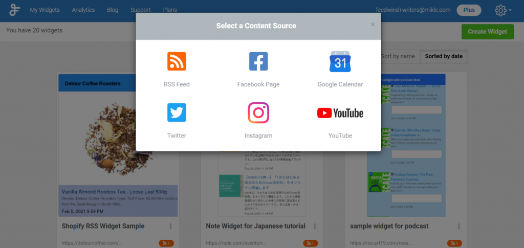
- Select Your Content Source: Choose RSS feeds as your content source.
- Customize Your Widget: Dive into the customization options and copy custom CSS from the following code snippet for the widget layout style. and paste it inside the direct input CSS option on the settings page.
- Embed and Showcase: Copy that embed code and paste it into your site. Watch as your digital presence blooms!
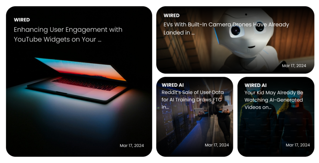
Bento Design Style Widget Demo
- Widget Settings
-
-
Create widget ->
RSS -
Feed URL ->
https://www.wired.com/feed/category/business/latest/rss -
General -> Width -> Responsive/In Pixels ->
Responsive -
General -> Style ->
Card -
General -> Height -> Posts ->
4 -
General -> Scroll ->
ON -
General -> Scroll -> Scroll Bar ->
OFF -
General -> Scroll -> Autoscroll ->
ON -
General -> Scroll -> Autoscroll ->
Normal -
General -> Scroll -> Scroll Speed->
4 -
General -> Advanced Settings -> Custom CSS -> Direct Input ->Show custom css
Note: Copy CSS from below, paste into your CSS file [your-file-name.css] , make changes as per your need and upload to your server or in Dropbox [ Check How to host CSS on Dropbox Click here], copy the complete CSS path [e.g. http//example.com/css/your-file.css] and paste in "Advanced -> Custom CSS -> Direct Input" field in FeedWind setting.


/* Copy CSS from here  */
 /* Container for the grid */
 .slick-slide {
     margin: 2rem;
 }

 .fw-hs-slick-item {
     position: relative;
     /* Set position to relative to contain the absolute pseudo-element */
     /* ... other existing styles for fw-hs-slick-item ... */
 }

 /* Pseudo-element for the gradient overlay */
 .fw-hs-slick-item .fw-feed-item::after {
     content: '';
     /* Required for pseudo-elements */
     position: absolute;
     /* Position it over the fw-hs-slick-item */
     top: 0;
     /* Align to the top of the fw-hs-slick-item */
     left: 0;
     /* Align to the left of the fw-hs-slick-item */
     right: 0;
     /* Align to the right of the fw-hs-slick-item */
     bottom: 0;
     /* Align to the bottom of the fw-hs-slick-item */
     background: linear-gradient(to bottom,
             rgba(0, 0, 0, 1) 0%,
             rgba(0, 0, 0, 0.2) 50%,
             rgba(0, 0, 0, 0.6) 100%);
     /* Gradient from dark at the top and bottom to transparent in the middle */
     z-index: 3;
     /* Place it above the item content but below any text or interactive elements */
 }

 /* Ensure that any content inside the fw-hs-slick-item is placed above the overlay */
 .fw-hs-slick-item>* {
     position: relative;
     z-index: 2;
     /* Higher z-index to ensure visibility above the overlay */
 }

 .fw-hs-slick-item {
     display: grid !important;
     grid-template-columns: repeat(4, 1fr);
     /* 4 columns */
     grid-template-rows: auto;
     /* Rows sized based on content */
     grid-gap: 10px;
     /* Gap between items */
     max-width: 1400px;
     /* Adjust the width as needed */
     margin: auto;
     /* Center the grid on the page */
 }

 /* General style for grid items */
 .fw-hs-slick-item .fw-feed-item {
     background-color: #444;
     /* Default background color */
     color: white;
     /* Default text color */
     border-radius: 20px;
     /* Border radius */
     padding: 0px;
     /* Padding */
     height: 200px;
     /* Set a fixed height for the items */
     overflow: hidden;
     position: relative;
 }

 /* Style for the large item, which is the first child */
 .fw-hs-slick-item .fw-feed-item:nth-child(4n+1) {
     grid-column: span 2;
     /* Span 2 columns */
     grid-row: span 2;
     /* Span 2 rows */
     background-color: #4CAF50;
     /* Green background color */
     height: auto;
     /* Adjust height to account for grid gap */
 }

 /* Style for the second item */
 .fw-hs-slick-item .fw-feed-item:nth-child(4n+2) {
     background-color: #2196F3;
     /* Blue background color */
     grid-column: span 2;
 }

 .fw-hs-slick-item .fw-feed-item:nth-child(4n+2) .fw-feed-item-title {
     font-size: 18px !Important;
 }

 /* Style for the third item */
 .fw-hs-slick-item .fw-feed-item:nth-child(4n+3),
 .fw-hs-slick-item .fw-feed-item:nth-child(4n+4) {
     grid-column: span 1;
     /* Span 1 column */
     grid-row: span 1;
     /* Span 1 row */
     background-color: #f44336;
     /* Red background color */
 }

 .fw-hs-slick-item .fw-feed-item:nth-child(4n+3) .fw-feed-item-title,
 .fw-hs-slick-item .fw-feed-item:nth-child(4n+4) .fw-feed-item-title {
     font-size: 14px !Important;
 }

 /* Style for the fourth item */
 .fw-hs-slick-item .fw-feed-item:nth-child(4n+4) {
     background-color: #ffeb3b;
     /* Yellow background color */
 }

 .fw-hs-slick-item .fw-feed-item .fw-feed-item-image {
     position: absolute;
     top: 0;
     left: 0;
     width: 100%;
     height: 100%;
     object-fit: cover;
     /* Cover the area of the parent div without losing aspect ratio */
     z-index: 1;
     /* Place the image below the text content */
 }

 #fw-feed-items .fw-feed-item-url[onclick] {
     height: 100%;
 }

 .fw-feed-item-content-module {
     height: 100%;
     z-index: 4;
     position: relative;
     padding: 1rem;
 }

 span.fw-feed-item-date {
     position: absolute;
     bottom: 4rem;
     right: 1rem;
 }

 span.fw-feed-item-link {
     position: absolute;
     top: 1rem;
     text-transform: uppercase;
 }

 .fw-feed-item-title {
     position: relative;
     top: 2rem;
 }

 /* Add responsive design rules as needed  */
  @media (max-width: 600px) {
    .fw-hs-slick-item {
      grid-template-columns: 1fr; /* 1 column on small screens */
 }

 .fw-hs-slick-item .fw-feed-item:nth-child(4n+1),
 .fw-hs-slick-item .fw-feed-item:nth-child(4n+2),
 .fw-hs-slick-item .fw-feed-item:nth-child(4n+3),
 .fw-hs-slick-item .fw-feed-item:nth-child(4n+4) {
     grid-column: span 1;
     grid-row: span 1;
     height: 200px;
     /* Reset to original height */
 }
 }


/* CSS Ends Here  */
-
Feed Title -> Custom ->
OFF -
Feed Content -> Display Content ->
Title -
Feed Content -> Size -> Item title ->
26 -
Feed Content -> Colors -> Title font ->
#ffffff -
Feed Content -> Colors -> Background ->
transparent -
Feed Content -> Advanced Settings -> Time/Date ->
ON -
Feed Content -> Advanced Settings -> Time/Date ->
[10] [#ffffff]
Rest keep as default
-
Create widget ->
Easy Steps
As we conclude, dear creators, we present to you a comprehensive guide to making a significant impact in the digital realm using the Bento Design (learn more) and FeedWind. By implementing these tools, you’ll not only enhance your digital space’s aesthetics but also forge a deeper connection with your audience, craft engaging narratives, and create a welcoming atmosphere. Dive in and watch your digital world transform from mundane to exceptional. Remember, in the vast sea of content, how you present your message is just as important as the message itself. Let’s commit to curating with creativity and flair!
This guide is not only informative but also entertaining, skillfully combining professional expertise with a dash of personal charm, guaranteeing that your audience will leave both enlightened and entertained.
Related posts

Do You Need to Parse RSS or Use a Ready‑Made Widget?
RSS parsing vs RSS widget is a common dilemma for developers and marketers wanting fresh content like news or blogs...

Embedding YouTube Videos: Easy Tips for a Smooth Experience
Videos are a great way to make your website more interesting. YouTube is the biggest site for sharing videos,...

Leveraging RSS Feeds for Local SEO: Strategies for Targeting Local Audiences with Practical Examples
Local SEO is a powerful tool for businesses to attract nearby customers. By improving your position in local search...