Specify container dimensions
- Set container width and height
-
- Open your RSS widget for editing (or create a new widget)
- Visit the "General" section of the setup screen
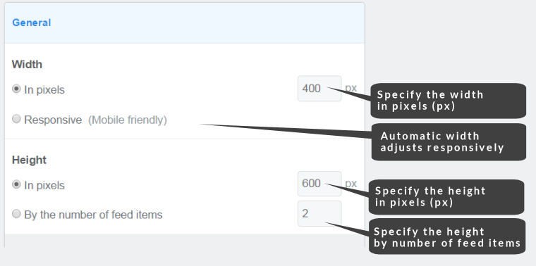
- Enter the container width in pixels or specify responsive (automatic) width
- Enter the container height in pixels or specify the height by the number of feed items you wish to display
- Save your using the Save & Get code button - if your widget is installed it will be auto-updated
Easy Steps
Specifying widget container dimensions
Container widths
The width of the FeedWind widget container can be specified in two ways:
1. Fixed number of pixels (px)
Fix the container width to a specific pixel size.
2. Responsive (mobile-friendly) width
With this setting, the container will automatically resize in a responsive manner as the browse window is resized. This option works best for most applications as most sites now require responsive behavior (also known as “mobile-friendly” as this allows mobile browsers to resize the widget in order to fit on any screen size).
Container heights
To offer maximum flexibility for users we provide two different methods for specifying the container height:
1. Fixed number of pixels (px)
With this method you can fix the container height to a specified number of pixels. Your widget container size can then be matched to dimensions of your website layout. To do this simply click on the radar button in the General Section of the FeedWind setup page and enter the number of pixels to set the height.
2. Fixed number of feed items
The alternative is to specify the number of feed items to display. This results in a container height which auto-adjusts to the length and number of items to be displayed.
Custom container sizing using CSS
Our advanced tutorial on customizing your RSS widget using CSS might help you create the container you want more precisely.
Customize containers with percentage dimensions (responsive sizing)
When developing for mobile devices for example it might be desirable to use container dimensioning that is a proportion of the container size. FeedWind Support percentage sizing (auto-sizing) selected at the General >Advanced Settings section “Responsive (mobile Friendly)” setting (see screenshot above) which responds to the size of the available display. HTML/CSS containers can also be percentage-sized using standard commands. You can achieve percentage-dimensioning by placing the FeedWind RSS widget inside nested containers (one container inside another). The first container can simply be the page itself or it can be a container on a page. The second is simply nested inside the first.
Assuming you are creating a container inside the page, there will be two containers created. The first will be the maximum container size you wish to put the RSS feed widget into. The second container will be defined as a percentage of the first, thus nesting the inner container so that it is bound by the desired percentage specification.
Using nested <div> example:
*** Blue area is the outer container
*** Yellow is the Inner Container ***
Why not use a zoom command instead of a <div> tag?
The zoom command might seem a good solution at first glance but this only works properly in Microsoft Internet Explorer (IE). In other browsers, zoom has no magnifying effect; it simply changes the size of the inner container relative to the outer one without magnification or reduction. Actual magnification–type zooming in and out is not possible in HTML or CSS apart from IE so it does work, but only covers a small (and shrinking) percentage of Internet users.
Using a <div> with percentage sizing will NOT have a magnifying effect either – there is no real widely available solution in HTML/CSS. Percentage sizing does allow you to restrain the dimensions in direct proportion to the available screen space. You can Right-click on the example below and use the console (Press F12 or select “examine element”) to see the HTML.
W3Schools is a great place to find out how this all works and learn to utilize the CSS that is available in order to get the optimum display of your FeedWind RSS widget. This link takes you to a website page where you can try out CSS or HTML code for yourself.
Related posts

Changing a Link Target in 3rd Party Content
Contents1 Copyright law applies to a link target2 Why we don’t offer a link editing feature3 Disabling links is...
Beef Up Your Titles
Contents1 Introducing a new feature to allow you to make titles bold in your FeedWind widgets.1.1 MAIN TITLE BOLD STYLING1.2...

FeedWind Analytics Feature
FeedWind’s Analytics feature is a mechanism for users to tally the amount of impressions received by a widget or...