Corner radius
Contents
- Modify corner radius
-
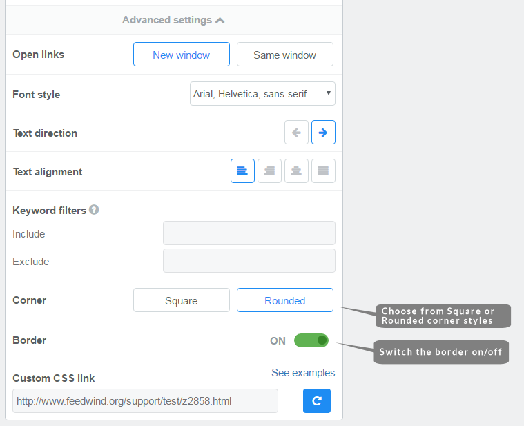
- Open your widget for editing (or create a new widget)
- In the General section, click to open the Advanced settings
- Scroll down to the entry labeled “Corner“
- Select your preference in corner style Square or Rounded
- Use the Save & Get code button to save your widget and copy the code
Easy Steps
Advanced corner radius styling
Corner radius with custom CSS
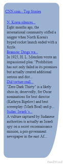
FeedWind allows for a standard corner radius of 4px (applied to all corners) in the General >Advanced Settings section of the setup screen. This is useful for a quick corner radius setting but for those who need radius settings to match design etc., a custom CSS is required. Making a rounded corner in CSS is an elegant way to improve the looks of a site by matching the design principles of the elements, such as the FeedWind widget, to theme elements or the template in use. Firstly it is helpful to know some information about the elements you are trying to match. If this is not a design aim, then just experimenting with different radius values is a good way to go. Once you are familiar with the settings you can apply them to the custom CSS that will allow you to integrate FeedWind to make it fit seamlessly into your site.
Create a custom CSS
First you need to create a custom CSS file (see our custom CSS tutorial here) using your favorite editor. Your custom CSS code should look something like this: We have added a basic border command which sets a radius of 10 pixels on all borders.
/* This adds the ability to utilize Google WebFonts in your FeedWind widget */
@import url(https://fonts.googleapis.com/css?family=Noto+Sans);

/* This is the styling for main feed container Corner Radius can be set here- NOTE: the background-color affects the footer background.*/
#fw-container {
 text-align: left;
 padding: 10px;
 font-family: 'Noto Sans', Helvetica, sans-serif;
 border: 1px solid #0E4FAE;
 border-radius: 10px;
 box-sizing: border-box;
 background-color:#4e82d0;
}

/* This is the styling for the header container*/
#header {
 margin: 10px 20px 10px 20px;
 color: #fff;
 font-size: 18px;
 background-color: #888;
 background-image: url("https://glassho.me/fwtest/bannertop.png");
 background-repeat: repeat-x;
}

a.fw-feed-item-url {
 text-decoration: none;
}

.fw-feed-item {
 display:block;
 }

/* This is the styling for the main Feed Title in the header container*/
.fw-feed-title {
 margin: 10px 20px 10px 20px;
 font-weight: bold;
 word-wrap: break-word;
 text-align: center;
 text-shadow: 2px 1px 0px #000080;
 display:block;
}

/* This is the styling for the Feed Title link in the header container*/
.fw-feed-title a:link {
 color: #fef;
 text-decoration: none;
}

/* This is the styling for a "visited" Feed Title link in the header container*/
.fw-feed-title a:visited {
 color: #ddd;
 text-decoration: none;
}

/* This is the styling for a Feed Title link on "mouseover" (also known as "hover") in the header container*/
.fw-feed-title a:hover {
 color: #fff;
 text-decoration: none;
}

/* This is the styling for an "active" Feed Title link in the header container*/
.fw-feed-title a:active {
 color: #fff;
 text-decoration: none;
}

/* This is the styling for the feed body (i.e all Feed Items) container. */
/* WARNING: be careful adding Left or Right Padding as you can lose the scrollbar when the L/R padding is set to more than 8px; the scroll-wheel on a mouse still works however, but the scrollbar can disappear after 8px of padding either side. Use Margins instead add space around the content container.*/


/* This is the styling for the Feed Item content in the body container*/
.fw-feed-item-content-module {
 margin: 10px;
 height: 160px;
 padding: 10px;
 border-bottom: 1px solid #bbceeb;
 box-shadow: 0px 1px 1px #222;
 background-color: #d1e3ff;
}

/* This is the styling for the Feed Item Title in the body container*/
.fw-feed-item-title {
 display:block;
}

/* This is the styling for an "unvisited/unclicked" Feed Item Title link in the body container*/
.fw-feed-item-title{
 margin: 20px 0 10px 0px!important;
 color: #00aeff;
 text-decoration: none;
 font-size: 16px;
}

/* This is the styling for a "visited/clicked" Feed Item Title link in the body container*/
.fw-feed-item-title:visited{
 color: #39f;
 padding: 20px 0 0 0;
 text-decoration: none;
}

/* This is the styling for a Feed Item Title link on "mouseover" (also known as "hover") in the body container*/
.fw-feed-item-title:hover{
 color: #39c;
 text-decoration: none;
 padding: 20px 0 0 0;
}

/* This is the styling for an active Feed Item Title link in the body container*/
.fw-feed-item-title:active{
 color: #09f;
 text-decoration: none;
 padding: 20px 0 0 0;
}

/* This is the styling affecting a Feed Item Date for a feed item in the body container*/
.fw-feed-item-date {
 display:block;
 margin: 0 20px 0 3px;
 padding: 0 2px 0 3px;
 color: #999;
 font-size: 10px;
 text-align: right;
}

/* This is the styling affecting a Feed Item Description, Thumbnail or Video Player link for a feed item in the body container*/
.fw-feed-item-link {
 margin: 0 0 0 3px;
 padding: 0 2px 0 3px;
 color: red;
 text-decoration:none;
 }
/* This is the styling affecting an "unvisited/unclicked" Feed Item anchor for a feed item in the body container*/
.fw-feed-item-link{
 color: #123456;
 text-decoration: none;
}

/* This is the styling affecting an "unvisited/unclicked" Feed Item Link anchor for a feed item in the body container*/
.fw-feed-item-link{
 color: #666666;
 text-decoration: none;
}

/* This is the styling affecting an "visited/clicked" Feed Item Link anchor for a feed item in the body container*/
.fw-feed-item-link:visited{
 color: #666666;
 text-decoration: none;
}

/* This is the styling for a Feed Item Title Link Anchor on "mouseover" (also known as "hover") for a feed item in the body container*/
.fw-feed-item-link:hover{
 color: #666666;
 text-decoration: none;
}

/* This is the styling affecting an "active" Feed Item Link anchor for a feed item in the body container*/
.fw-feed-item-link:active{
 color: #666666;
 text-decoration: none;
}

/* This is the styling for the Description in a Feed Item (i.e. the text of a Feed Item in Thumbnail mode, or text+images in Full HTML mode)*/
.fw-feed-item-description {
 font-size: 12px;
 text-align: left;
 margin: 10px;
 color: #666;
 font-weight: 300;
 word-wrap: break-word;
 text-decoration:none;
 display:block;
}

/* This is the styling for a Feed Item Thumbnail - Thumbnail size and layout/orientation can be set here. This does not affect a YouTube video thumbnail.*/
.fw-feed-item-image {
 width: 150px;
 height: 120px;
 float: left;
 text-align: left;
 margin: 20px 20px 10px 10px;
}

.fw-feed-item-image-module {
 margin: 20px 20px 20px 20px;
}

/* This styling allows you to create a footer and style it. By default the footer size is set to zero. */
.fw-branding {
 height: 42px;
}

/* These control the scrollbar and scrollbar background colors */
/* NOTE: the ! important tag is used here to override any other CSS controlling the scrollbar appearance */
/* .jspTrack{background: #aec5e8 !important;} */
/* .jspDrag{background: #4e82d0!important;} */
Border radius CSS parameters
Simple border-radius example
 This is for a simple radius that is even in both x and y dimensions.
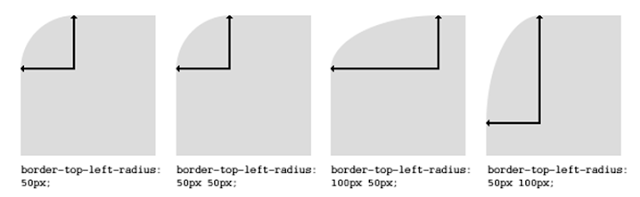
border-radius: 20px 20px 125px 125px;This will set each border radius to 20 pixels as in the top left and right corners of the example image. If you set a radius larger than 50% of any of the dimensions of the container then the maximum radius will be the default. This means that for a container 100px wide, any radiuses used over 50px will default back to a maximum equivalent to the width of the container.
The image example shows a bottom border-radius set to 150px – the container width is only 200px which puts the radius beyond that allowable for the simple border-radius command so the maximum radius is used forming a circular shape.
Browser support for corner-radius CSS
Browser support for these radius commands is varied; Chrome, Safari, and Opera have no problems with the –WebKit prefix for previous versions but are not necessarily above V5. Firefox requires the –moz prefix adding and only Internet Explorer V9 is able to deal with radius in CSS.
Firefox radiused corners
The following code is improved slightly to take account of Firefox and enable support. The –moz-border-radius command has the same effect in Firefox as the border-radius command.
-moz-border-radius: 10px;

border-radius: 10px;
Defining complex radiused corners using CSS
The border-radius command covers more than simple radius measurements in pixels. Defining an off-center radius allows for dual corner radius profiles and radius centers outside the container. These are the available radius commands: Where R1 and R2 are the radius measurements in pixels. ems or %. If no measurement type is put in, the command assumes pixels to be the chosen units. A zero value anywhere returns a square corner.
border-bottom-left-radius: R1 R2;

border-bottom-right-radius: R1 R2;

border-top-left-radius: R1 R2;

border-top-right-radius: R1 R2;
These are all varying ways to apply a radiused corner giving these results and can be expressed as a pixel length or as a percentage, for example:
border-top-left-radius: 50px;
border-top-left-radius: 50px 50px;
border-bottom-right-radius: 8% 4%;
border-top-right-radius: 6px;
This diagram shows the possibilities:
In most cases, the user will want to determine the radius of all corners simultaneously so this property can take one or two value sets, each containing one-four dimensions in pixels or percentages. Where only a single value set is present, the horizontal/vertical settings will be matched. However, the parameters and the use of the broader range of border-radius commands allow significant flexibility when it comes to design.
How to achieve some common corner radius shapes
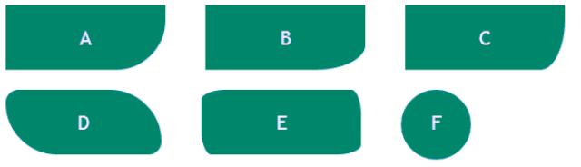
The code below will produce the corner effects as in the diagram above where CornerboxA is the code for the shape ‘A’ above, CornerB for B, etc.
#cornerboxA {height: 65px; width:160px;
-moz-border-radius-bottomright: 50px;
border-bottom-right-radius: 50px;
}
# cornerboxB{height: 65px;width:160px;
-moz-border-radius-bottomright: 50px 25px;
border-bottom-right-radius: 50px 25px;
# cornerboxC{height: 65px;width:160px;
-moz-border-radius-bottomright: 25px 50px;
border-bottom-right-radius: 25px 50px;
}
# cornerboxD{height: 5em;width: 12em;
-moz-border-radius: 1em 4em 1em 4em;
border-radius: 1em 4em 1em 4em;
}
# cornerboxE{height: 65px;width:160px;
-moz-border-radius: 25px 10px / 10px 25px;
border-radius: 25px 10px / 10px 25px;
}
# cornerboxF{height: 70px;width: 70px;
-moz-border-radius: 35px;
border-radius: 35px;
}
Some examples of complex corner radius
 The “border-radius” command in line 2 of our original example can use a variety of settings. This code:
border-radius: 5px 20px 200px 20pxadds simple radius and displays this shape>>
To get a broader curve, the code could contain:
border-bottom-right-radius:50px 200pxThis ignores the other corners and needs
border-top-left-radius: 15px;

border-top-right-radius: 15px;

border-bottom-left-radius: 15px;
 added to display this shape>>
To achieve the rounded corner effect when using the extended radius commands, standard border-radius commands will be ignored so to achieve a combination of different radiuses, the more complex radius command set MUST be used and applied to each corner. An example might be used where a page flip link is placed at the bottom right-hand corner which might open a new page with a full RSS newsreader. The whole definition for radiusing these corners would be:
You will see that in line 4, there are two dimensions. This allows for very accurate radius control with the ability to specify dual radius points for every single corner.
border-top-left-radius: 15px; 2.border-top-right-radius: 15px; 3.border-bottom-left-radius: 15px; 4.border-bottom-right-radius: 50px 200px;Conclusion
A little tinkering about with your radius settings can make a real difference when integrating FeedWind into a site. Creating a custom CSS is not overly complex and can open the door for many other customizations of your FeedWind widget. There is ample opportunity to use radiused shapes to add more interesting looks and ergonomics to your site. It’s pretty easy to get these changes in place too, so give them a try and customize your RSS widget output!
Related posts

Changing a Link Target in 3rd Party Content
Contents1 Copyright law applies to a link target2 Why we don’t offer a link editing feature3 Disabling links is...
Beef Up Your Titles
Contents1 Introducing a new feature to allow you to make titles bold in your FeedWind widgets.1.1 MAIN TITLE BOLD STYLING1.2...

FeedWind Analytics Feature
FeedWind’s Analytics feature is a mechanism for users to tally the amount of impressions received by a widget or...