Create a single column widget for mobile
Contents
Single column widget for mobile features helps you decide how many feeds/posts widgets can have on mobile devices. As a result, you will have easy-to-read widgets in stacked/vertical format. This feature gives the desktop version the flexibility to change the view with multiple feeds/posts in horizontal format.
Examples
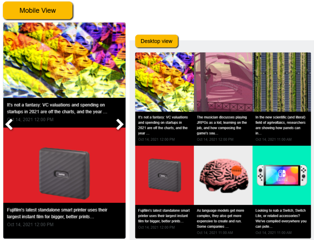
You can display the different layouts on Desktop and Mobile as follows.
Desktop view > 3 (Columns) x2 (rows) – layout horizontally
Mobile view > 2 feed layout vertically
Learn how to use the single-column widget on mobile to create a responsive widget
The single-column widget involves three parts.
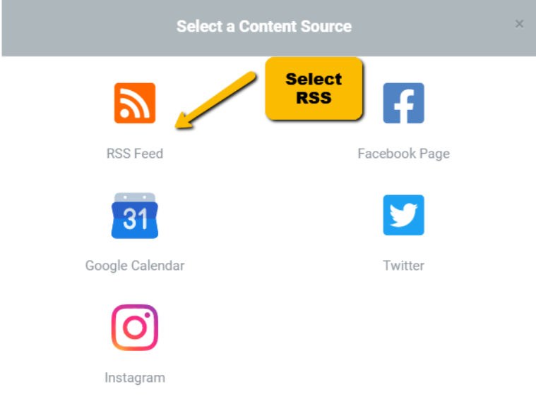
- Widget type: RSS
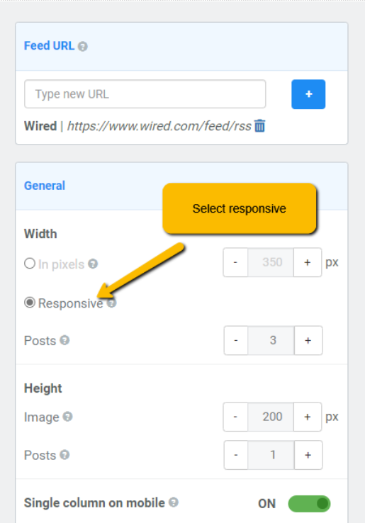
- The widget should be responsive by Width
- Style should be Card or Overlay
Create the widget in FeedWind
To set up a single column widget for mobile, you’ll first create the RSS widget.
In your widget setting screen, navigate to General ➤ Width ➤ Select “Responsive”
Under style, select ‘Card’ or ‘Overlay’
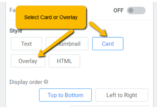
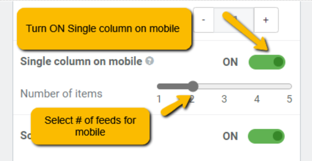
Once Card / Overlay is selected, this will enable the “Single column on mobile” feature option. Please turn “ON” to activate this feature, then choose the number of items displayed only on mobile vertically.
Click Save & Get code
Related posts

Do You Need to Parse RSS or Use a Ready‑Made Widget?
Contents1 What “parsing RSS” really means2 What an RSS widget actually is3 When developers should parse manually4 When non‑technical...

How to Dynamically Display WooCommerce Products on Your Website Using FeedWind
Contents1 Step 1: Access Your WooCommerce Product RSS Feed2 Step 2: Add Product Images to Your RSS Feed3 Step...

How to Create a Vimeo Video Widget for Your Website – Easy Guide
Contents1 Step 1: Get the Vimeo Video Feed2 Step 2: Create a FeedWind Account3 Step 3: Make Your Vimeo...